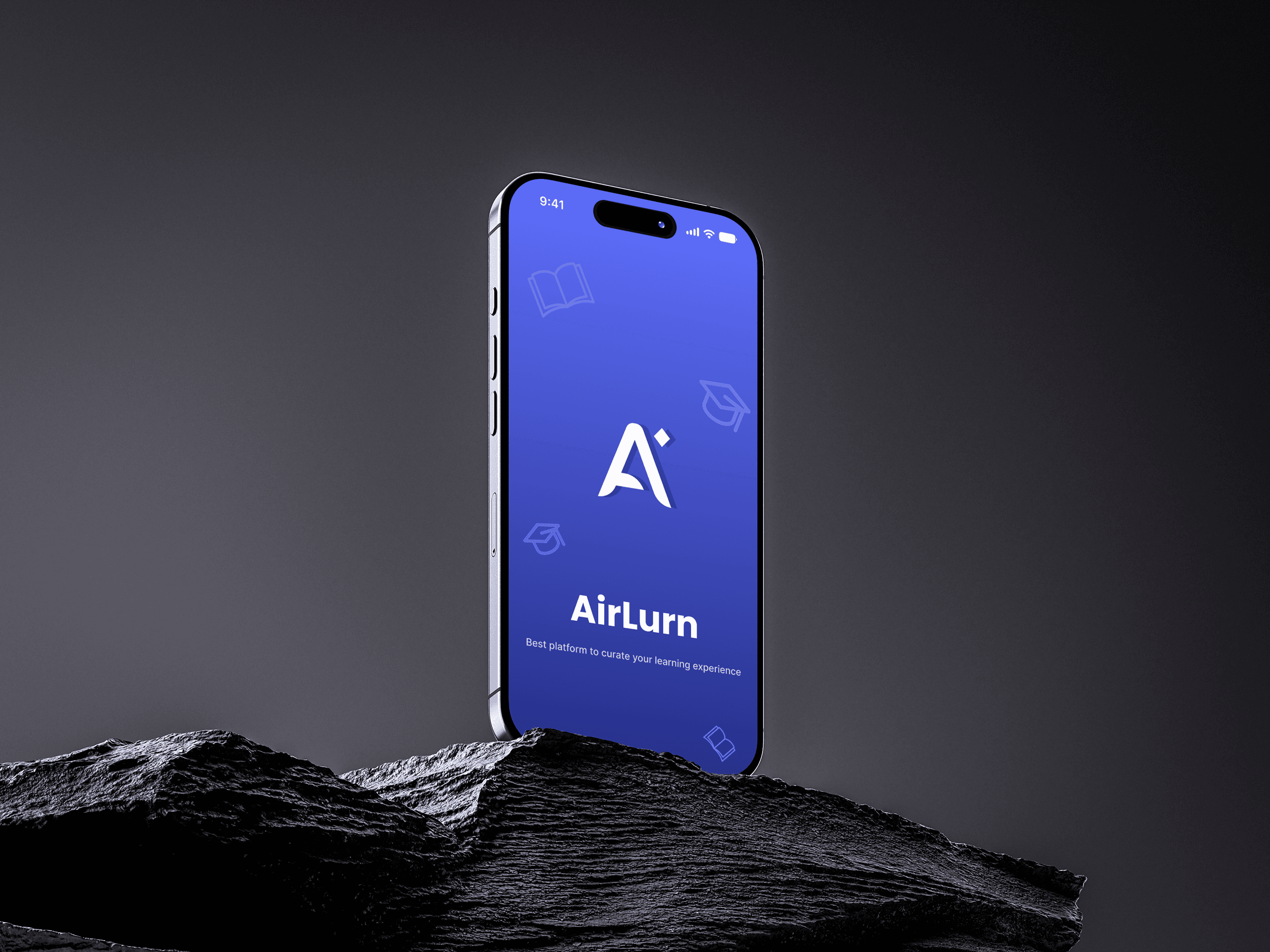
Airlurn: Turning Course Sign-Ups Into Learners Who Actually Finish
- Role
- Design Direction and End-to-end product design
- Client
- Airlurn
- Services
- Product Design, Mobile App, UX Research
Most learning apps are great at sign-ups and quietly terrible at finishing. Airlurn wanted the opposite - and had two very different audiences to win over.
Challenge
Trainers wanted power, learners wanted focus, and one app had to serve both.
Approach
One shared mental model - courses, modules, progress - with two experiences built on top.
The problem
What Was Airlurn Up Against?
Learners don't quit because the content is bad. They quit because tomorrow's lesson feels like homework and nobody can see how far they've come.
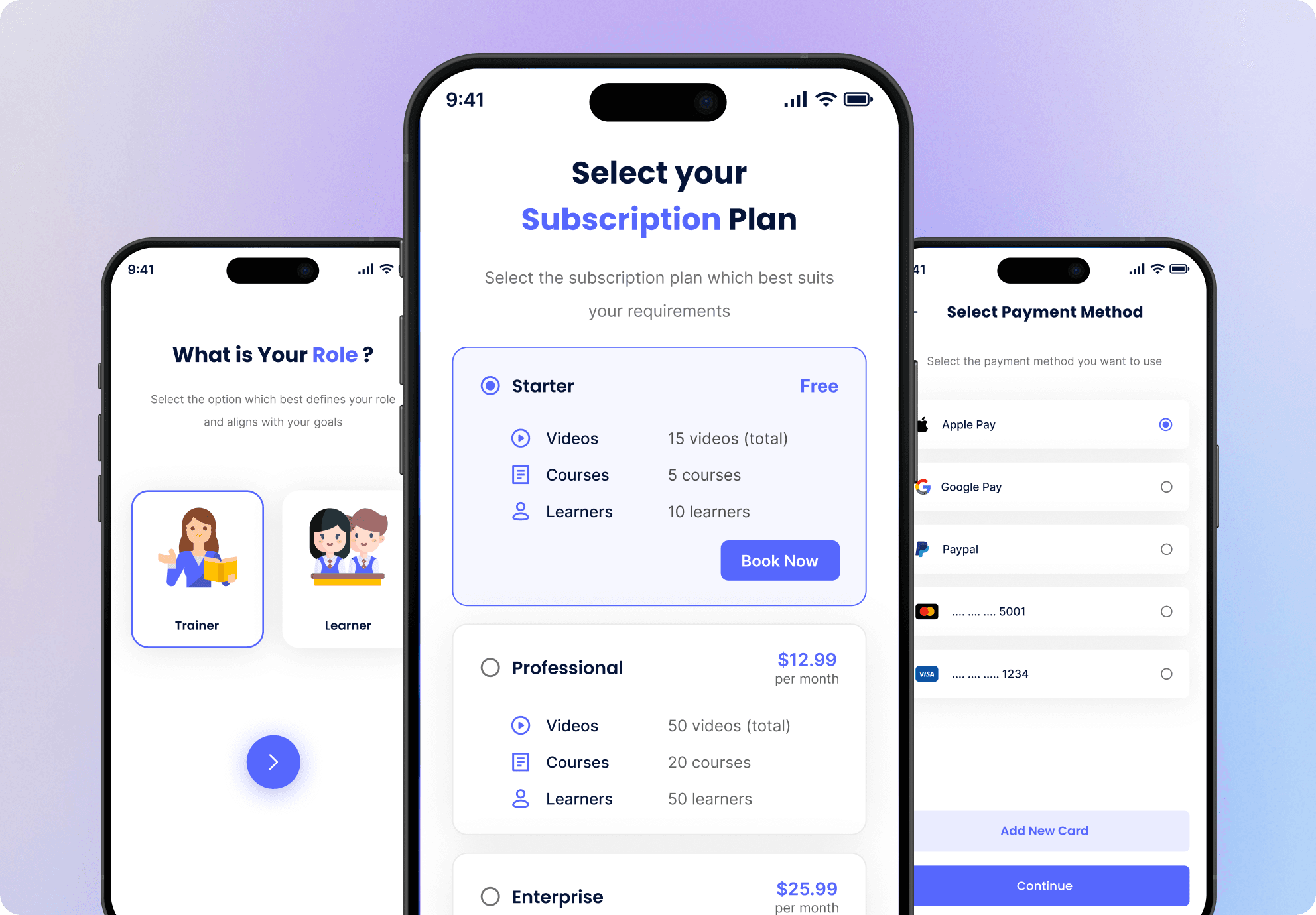
Airlurn also had to win over trainers who needed real tools to build and manage courses. Design for one audience and you lose the other.
The approach
How Did We Approach It?
- 01Gave both audiences one mental model - courses, modules, progress - so trainers build exactly what learners see
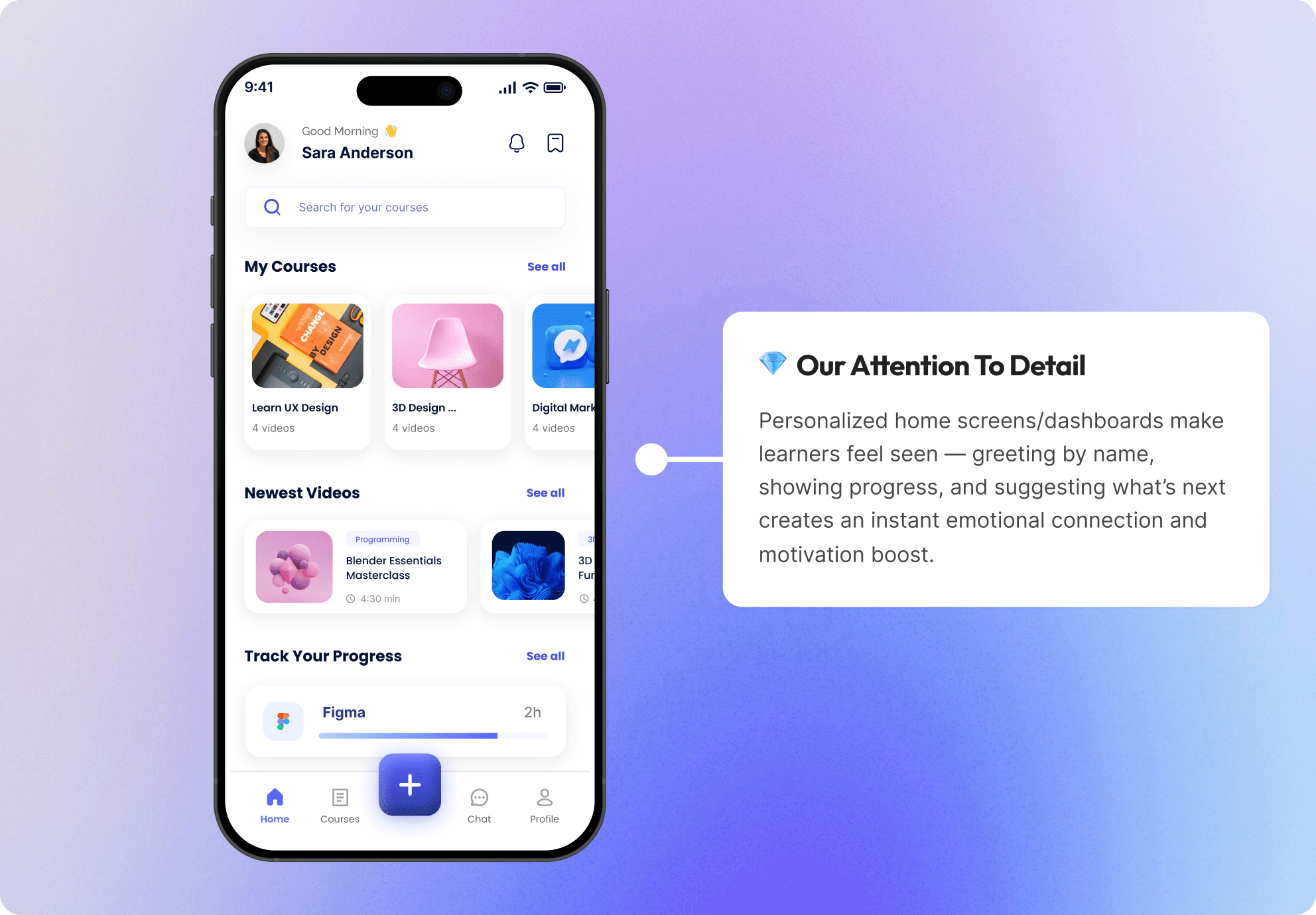
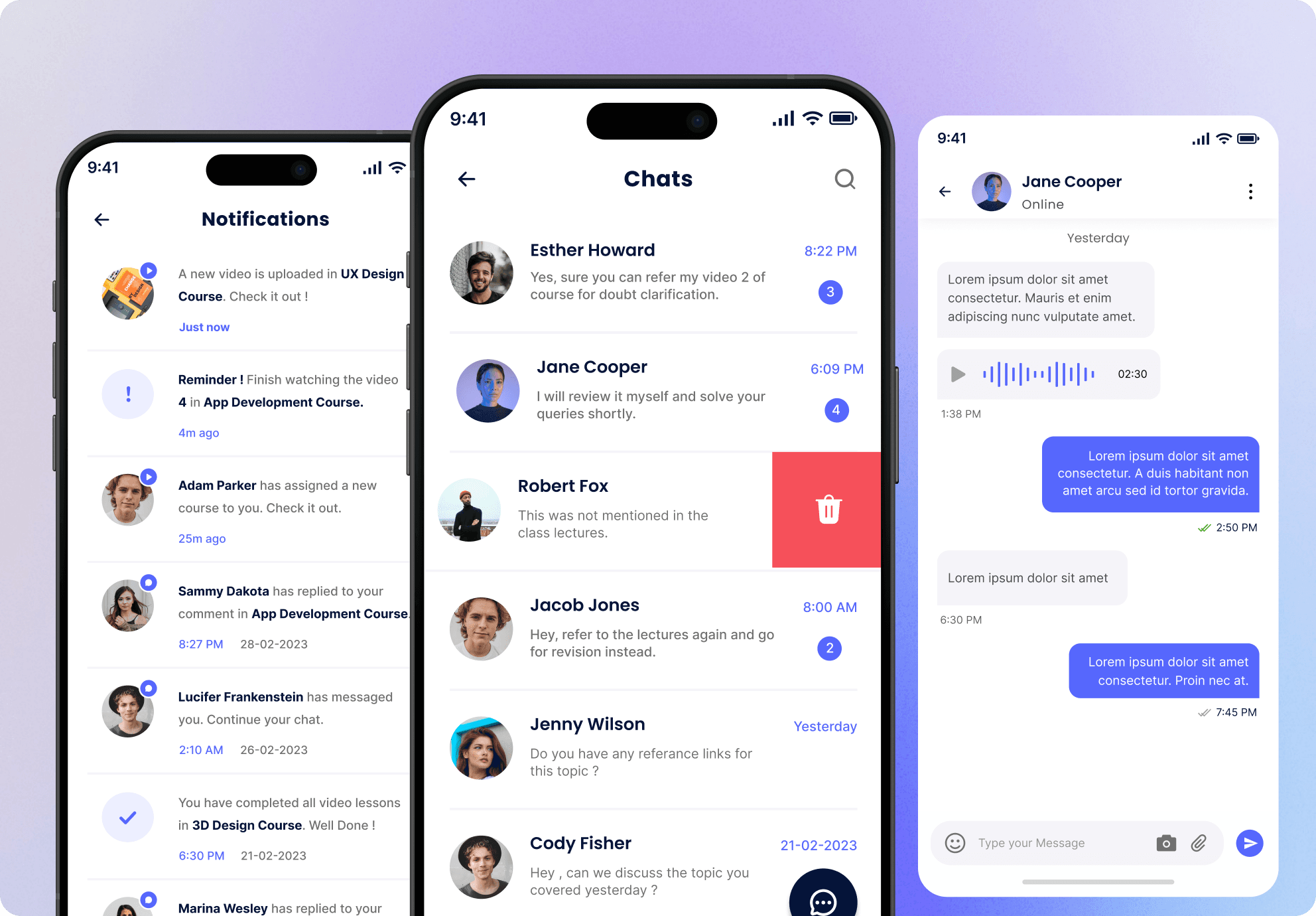
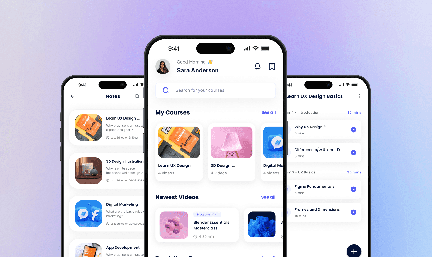
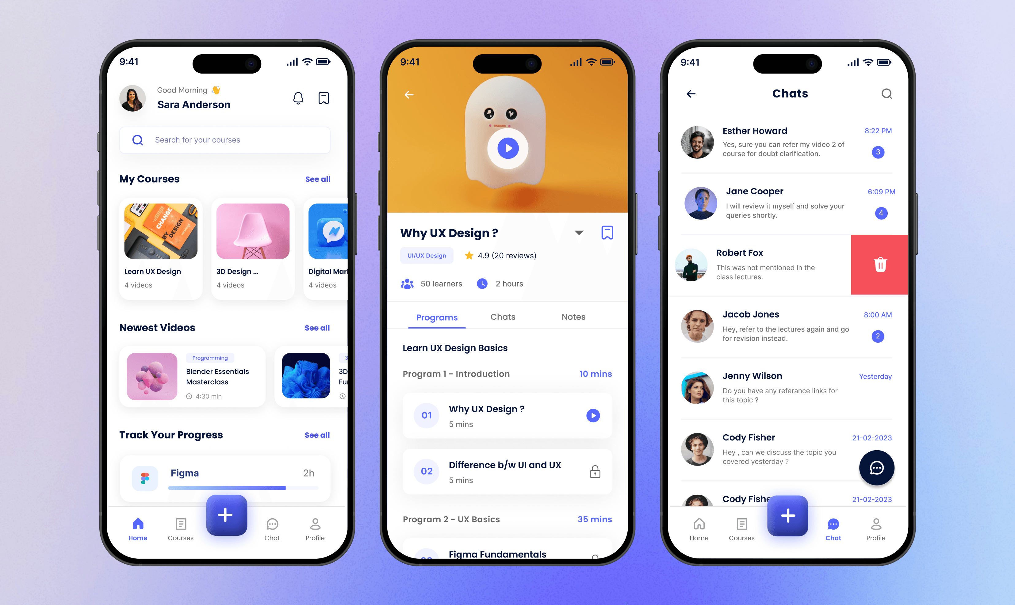
- 02Designed a learner home that answers what to continue, what's new, and what's next without a single tap
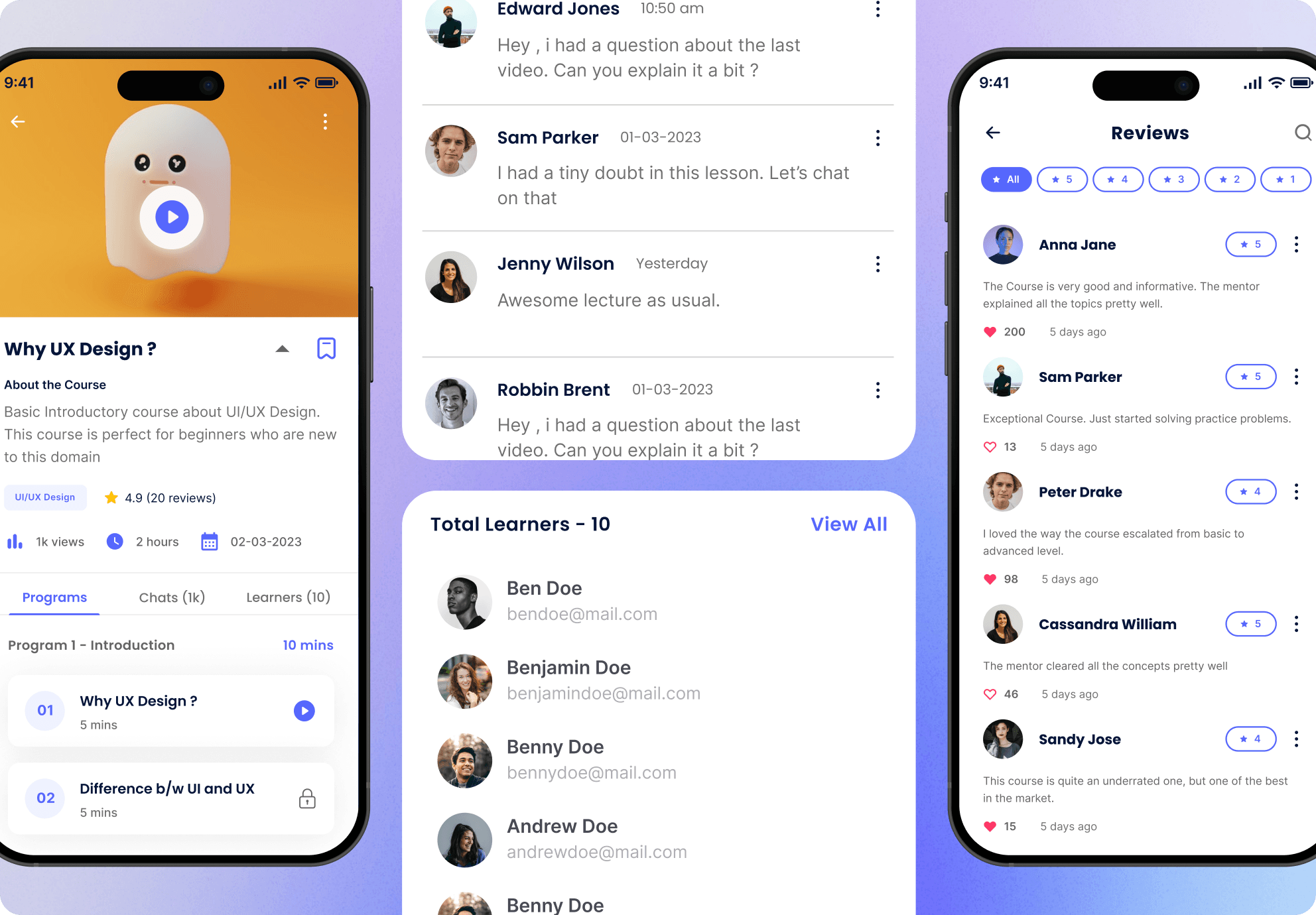
- 03Cut lessons into bite-sized modules with visible durations, so every session feels achievable
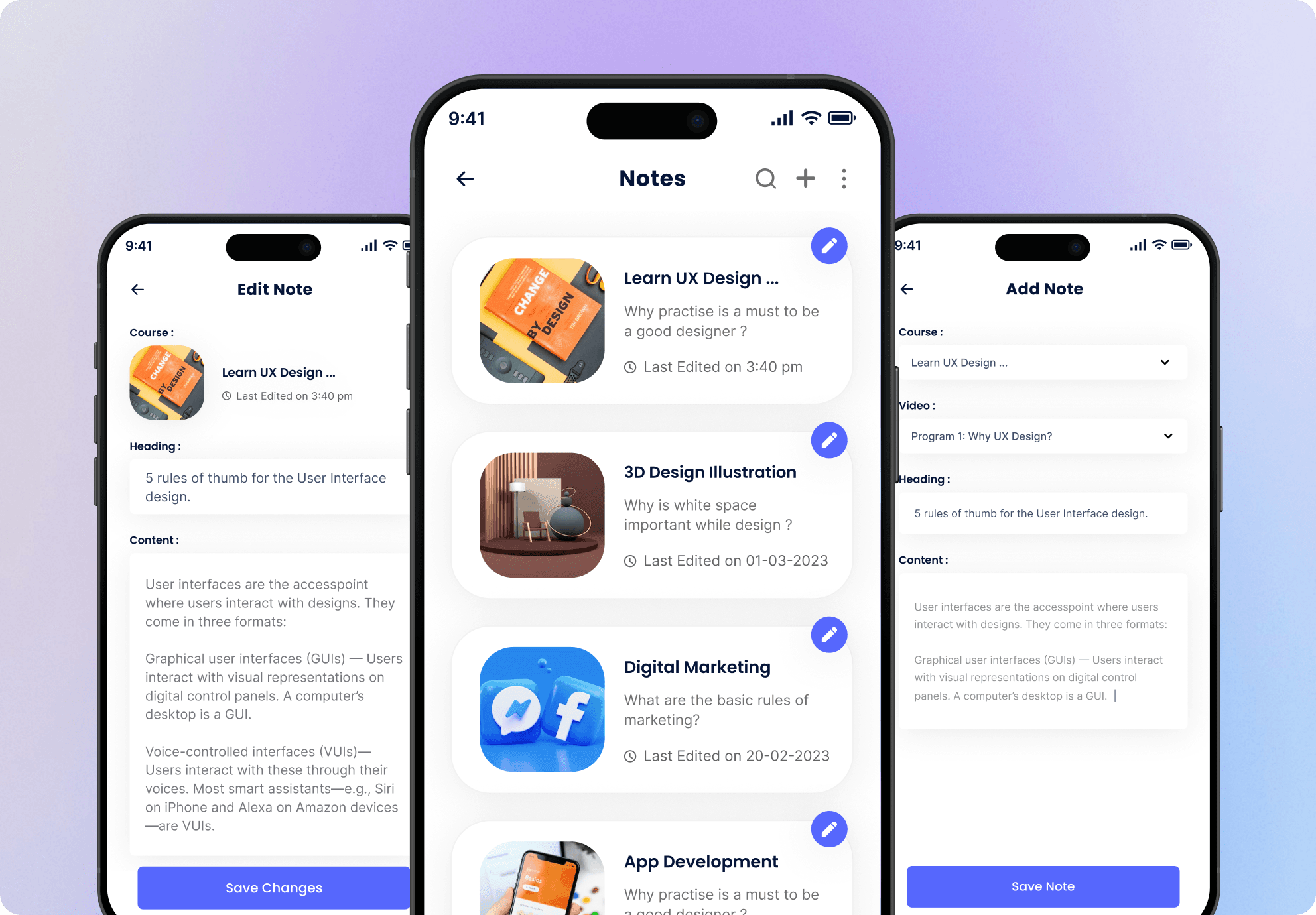
- 04Wove notes and bookmarks into lessons, turning passive watching into active learning
Results
What Results Did Airlurn Achieve?
Week 1
2
Audiences mapped onto one shared model, so trainer tools and learner screens never drift apart.
Month 1
1 tap
From opening the app to continuing your last lesson.
Ongoing
2 apps
iOS and Android running on one design system, ready for new course formats.
Beyond the numbers, progress became something learners can see and feel - and that's the thing that brings people back tomorrow.
Showcase
The work, up close
FAQ
Thinking about something like this?
Airlurn went from an app people signed up for to one they keep coming back to - and trainers finally have tools that keep up.